Overview
PulseView is a Jira Cloud app that analyzes your team's Jira activity and presents it as structured delivery insights. It reads issue transitions, sprint data, impact scores, and workflow patterns — then surfaces metrics like cycle time, throughput, bottleneck location, delivery health, and performance trends.
PulseView is organized into six main views, each designed for a different aspect of delivery understanding:
- Dashboard — High-level team performance and key metrics at a glance
- Team — Team-level delivery analysis: issues, impact, and flow metrics
- People — Individual member rankings, contributions, and performance patterns
- Work — Complete issue history with breakdowns by type, priority, and contributor
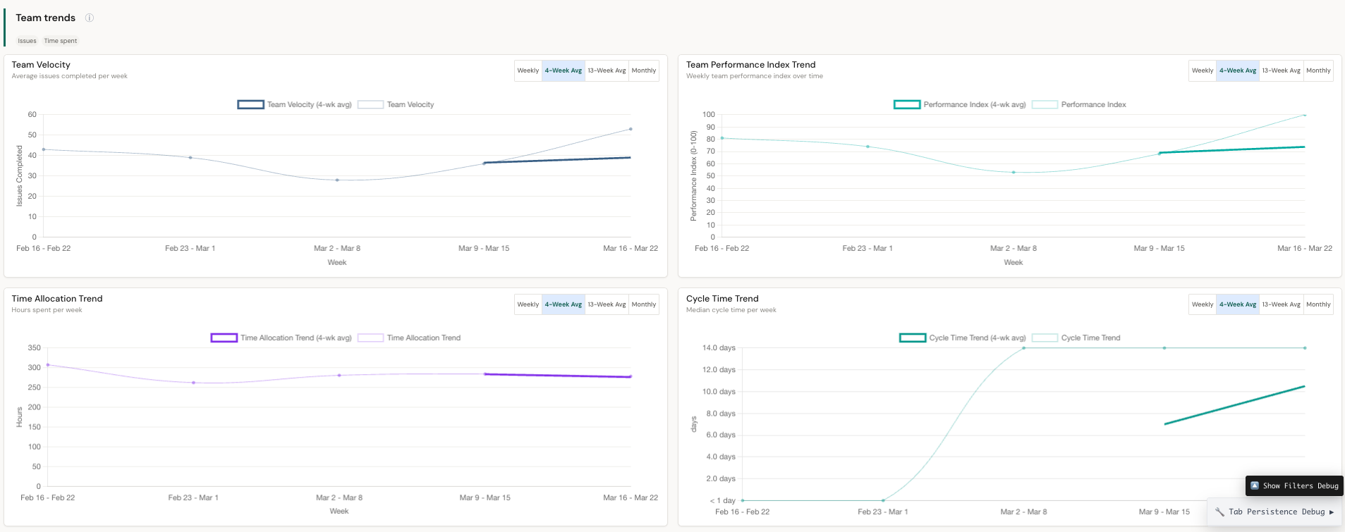
- Trends — Weekly performance trends and progress tracking over time
- Report Builder — Generate a ready-to-paste LLM prompt from your current filters
Getting Started
PulseView installs from Atlassian Marketplace and connects to your Jira Cloud instance.
Installation
- Go to Atlassian Marketplace and search for PulseView
- Click "Try it free" to begin installation
- Authorize PulseView to access your Jira Cloud instance
- Once installed, PulseView appears as an app in your Jira navigation
First use
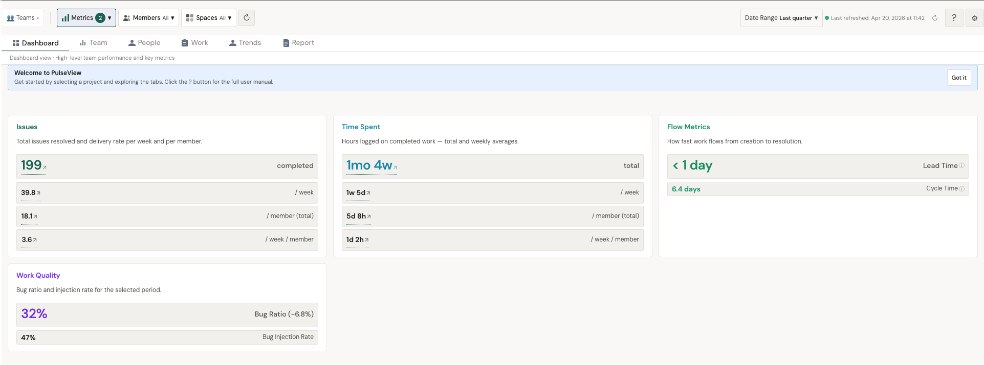
After installation, open PulseView and select a project. The app begins by selecting your team — you'll see filters for Metrics, Members, and Spaces at the top. Choose your date range and team scope. The dashboard loads automatically with your team's key metrics.
Dashboard
The Dashboard is your high-level entry point. It shows team performance at a glance through key metric cards and manager alerts.
Key metrics
Manager Alerts
The dashboard surfaces automated alerts when something needs attention — a team member's metrics have changed significantly, delivery health needs review, or anomalies are detected.
Team View
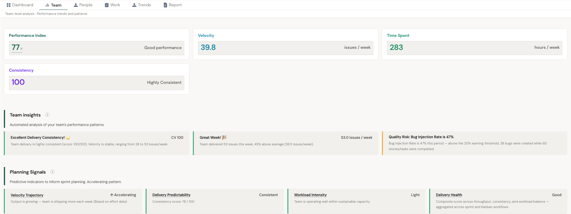
The Team tab provides team-level analysis with performance trends and patterns. It shows key performance indicators and automated insight cards.
Issues panel
Total issues resolved and delivery rate per week and per member. Shows completed count, weekly rate, per-member totals, and per-member weekly averages.
Impact panel
Strategic value delivered — total and weekly averages. Breaks down into completed total, weekly rate, per-member total, and per-member weekly rate. This helps you understand not just volume but the weight of what's being delivered.
Flow Metrics panel
How fast work flows from creation to resolution. Includes:
- Lead Time — Total time from issue creation to resolution
- Cycle Time — Time from when work actively starts to when it's done
Performance Index breakdown
Below the metrics, you'll find the Performance Index breakdown showing how Impact, Efficiency, Effort, Task Count, and Work Quality contribute to the composite score.
People View
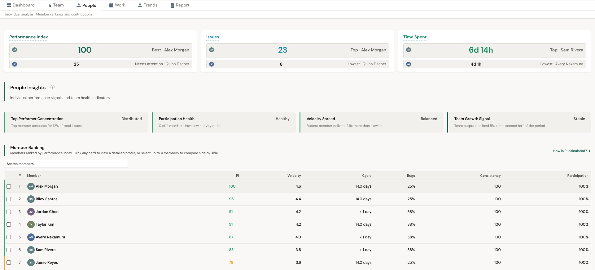
The People tab provides individual analysis — member rankings and contributions. This is where you understand how work is distributed across your team.
Team insights
PulseView generates automated analysis of your team's performance patterns. Examples:
- Excellent Delivery Consistency — Team delivery is highly consistent, velocity stable
- Great Week — Team delivered significantly above average this period
- Scoring Anomaly — Unusually high Impact scores detected that may indicate inconsistent scoring
People insights
Individual performance signals and team health indicators, including:
- Top Performer Concentration — Whether output is distributed or concentrated in a few members
- Participation Health — Activity ratio across team members
- Velocity Spread — Gap between fastest and slowest delivery speeds
- Impact Distribution — How impact delivery is spread across the team
- Team Growth Signal — Whether team output is growing or declining over time
Member Ranking
Members ranked by Performance Index. The table shows PI score, Velocity, Impact, Cycle Time, Consistency, and Participation for each member. Click any member to see their detailed profile.
Member detail view
Clicking a member opens their individual profile with:
- Personal metric cards (PI, Velocity, Impact, Consistency, Cycle Time)
- Forecast Contribution percentage
- Automated member insights (e.g., "High Impact Contributor", "Reliable Contributor", "Delivery Streak")
- Planning Signals comparing their patterns to the team
Planning Signals
Planning Signals show personal delivery patterns and how they compare to the team. Displayed at both team and individual levels:
- Velocity Trajectory — Is output growing, stable, or declining?
- Delivery Health — Composite score across throughput, consistency, and workload balance
- Weekly Delivery Target — Team-wide weekly delivery target
- Impact Delivery — Is impact output growing?
- Delivery Predictability — Consistency score out of 100
Work View
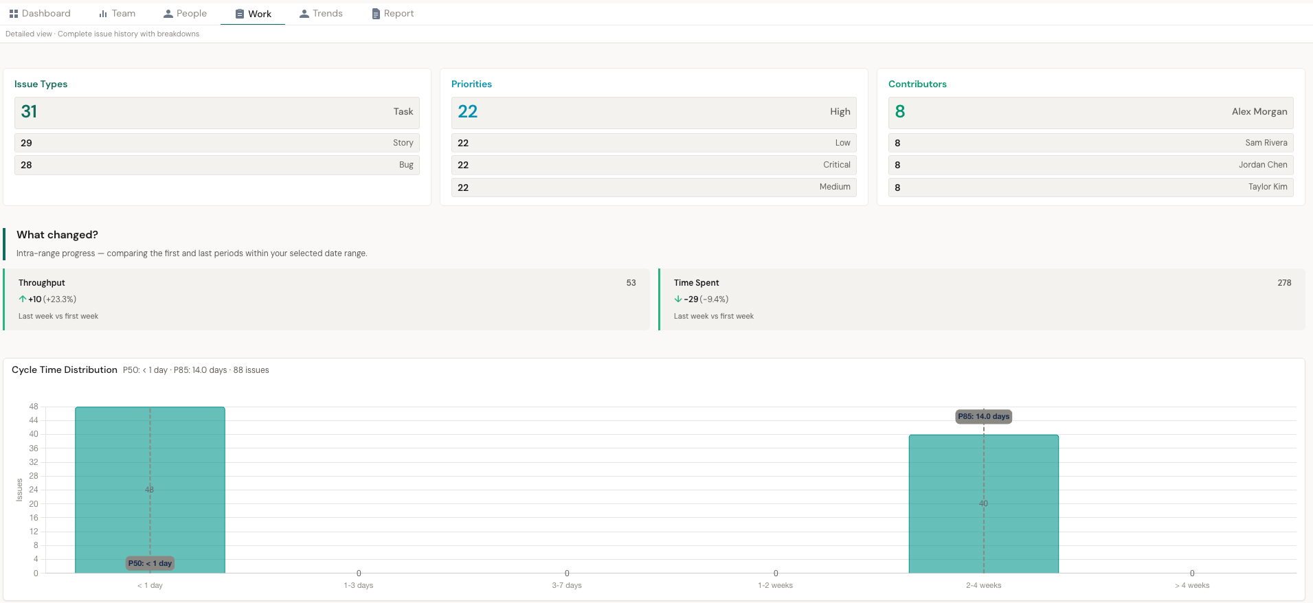
The Work tab is the detailed view — complete issue history with breakdowns. It gives you the raw data behind the metrics.
Issue breakdowns
- Issue Types — Distribution across Task, Bug, Story
- Priorities — Distribution across Medium, High, Low, Highest
- Contributors — Who completed the most issues in the period
What changed?
Intra-range progress — comparing the first and last periods within your selected date range. Shows throughput and impact changes with percentage differences (e.g., "+37 (+925%)" throughput improvement).
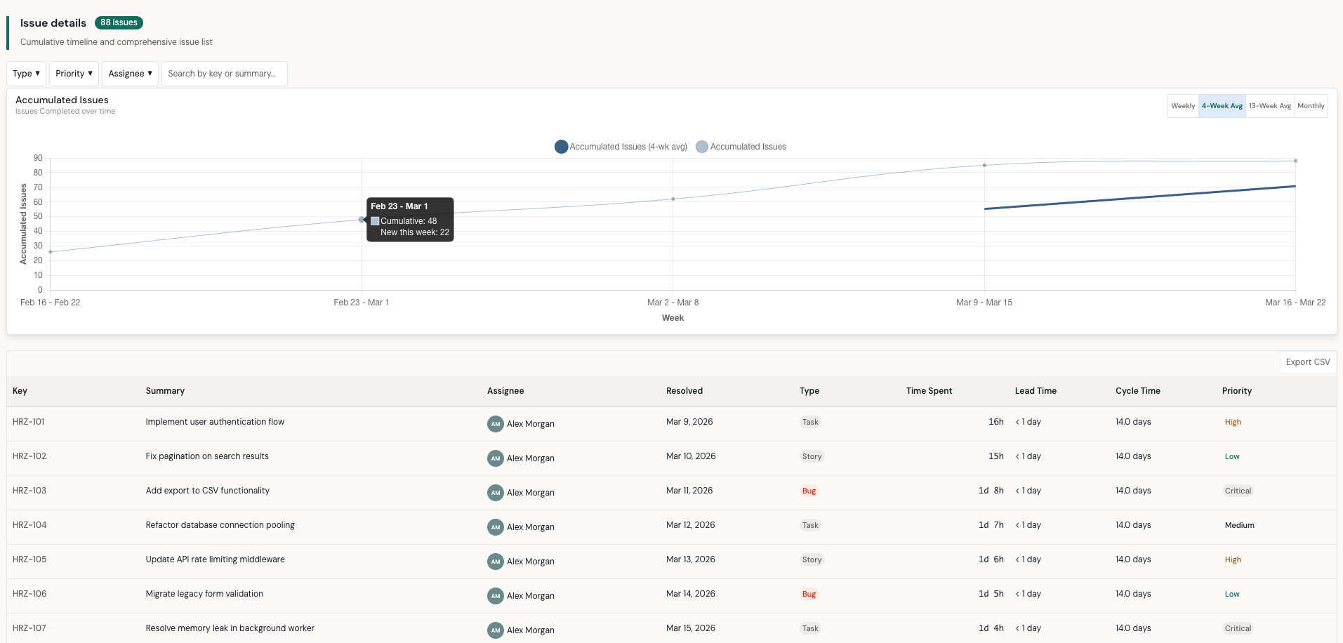
Accumulated Issues & Issue detail list
Cumulative issue completion over time with 4-week average trendlines. Plus a full issue list with Key, Summary, Assignee, Resolved date, Type, Impact, Lead Time, Cycle Time, and Priority — filterable and searchable.
Cycle Time Distribution
Histogram showing how cycle times are distributed across your issues. Displays P50 (median) and P85 percentiles. This helps you understand your typical delivery speed and identify outliers.
Trends
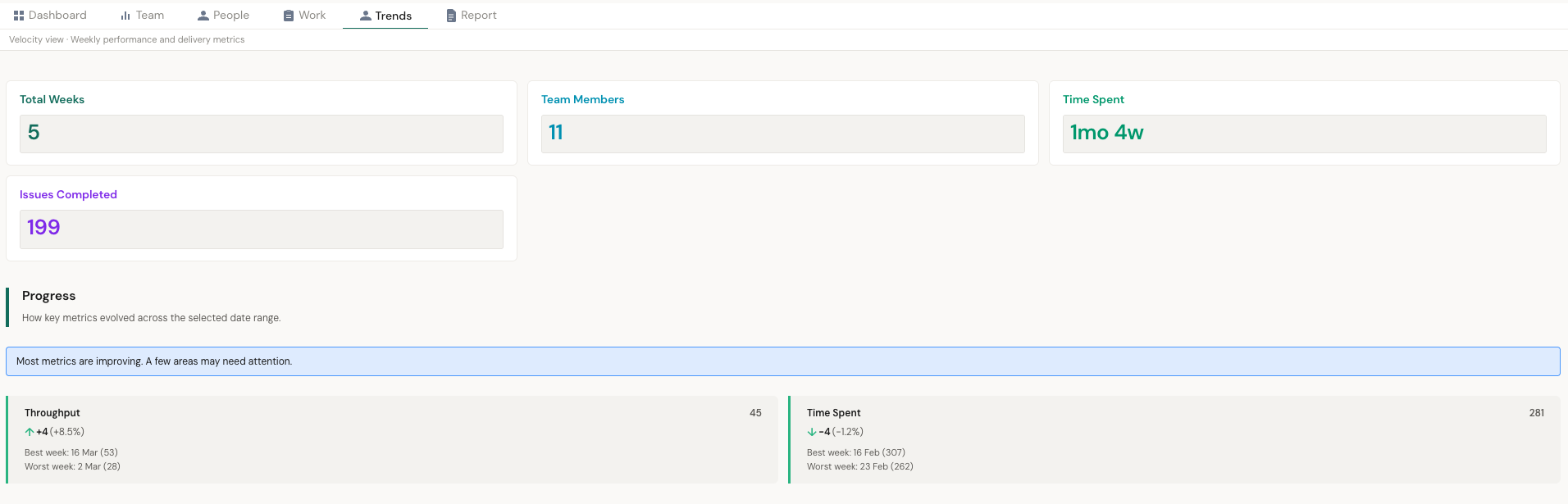
The Trends tab shows weekly performance and delivery metrics over time. It provides the velocity view with progress tracking.
Summary cards
Progress
Shows how key metrics evolved across the selected date range. Highlights whether all tracked metrics are trending upward ("strong momentum") or if some need attention. Includes period-over-period comparisons for Throughput and Impact.
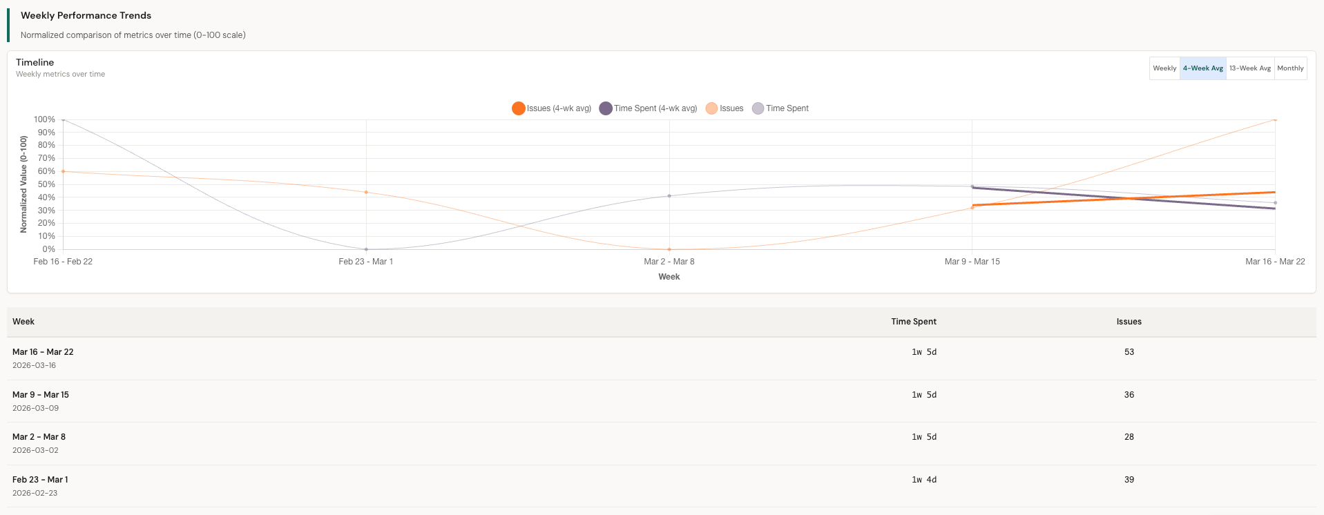
Performance trends charts
Individual member performance trends shown as line charts with Issues and Impact tabs. Tracks each member's accumulated delivery over time against the team average. Available in Weekly, 4-Week Avg, 13-Week Avg, and Monthly views.
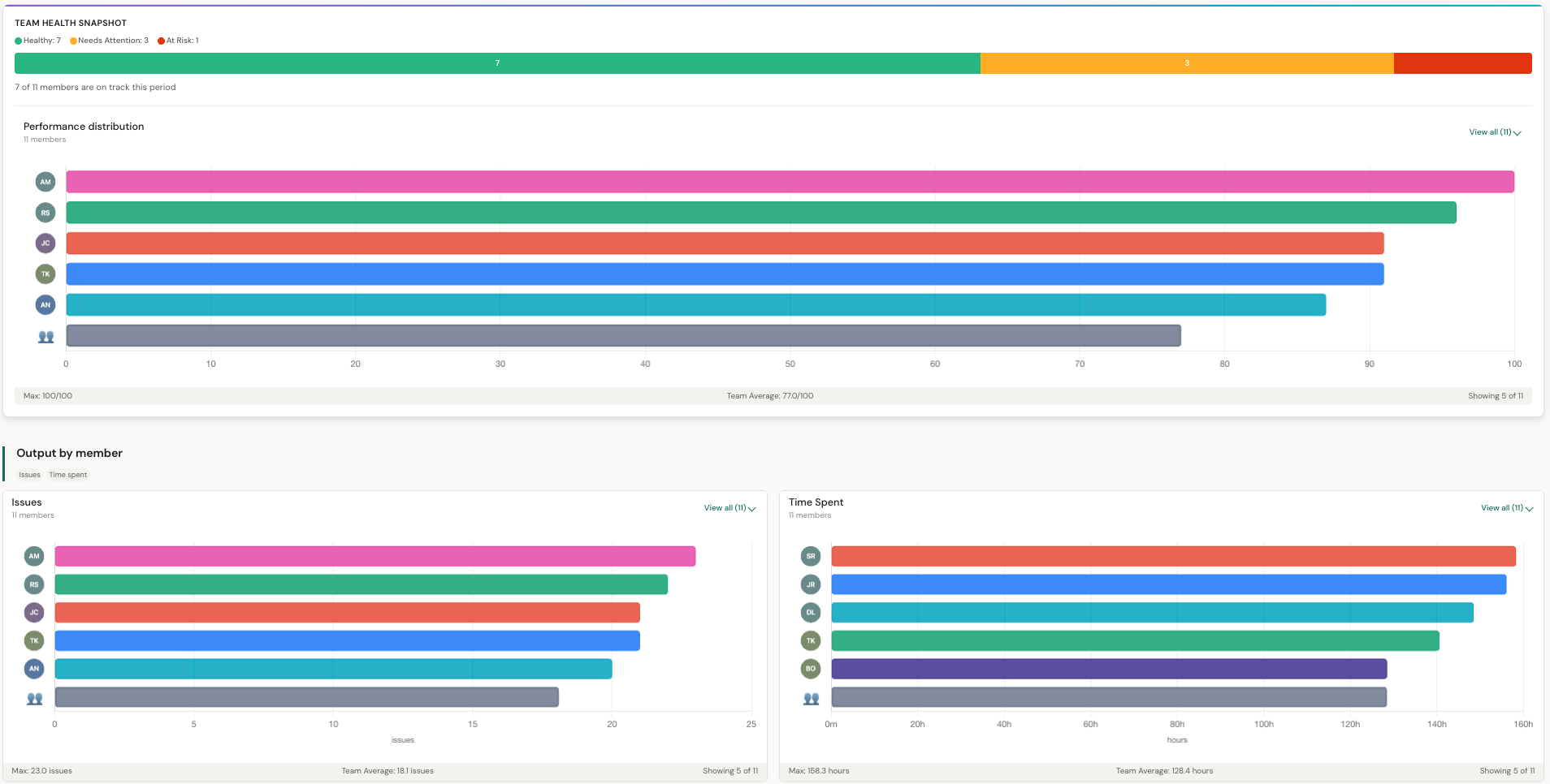
Output by member
Horizontal bar charts comparing individual output. Shows both Issues and Impact side by side with team max and average reference lines.
Performance distribution
Team Health Snapshot showing how many members are Healthy, Need Attention, or At Risk. The performance distribution chart visualizes the spread across the team.
Report Builder
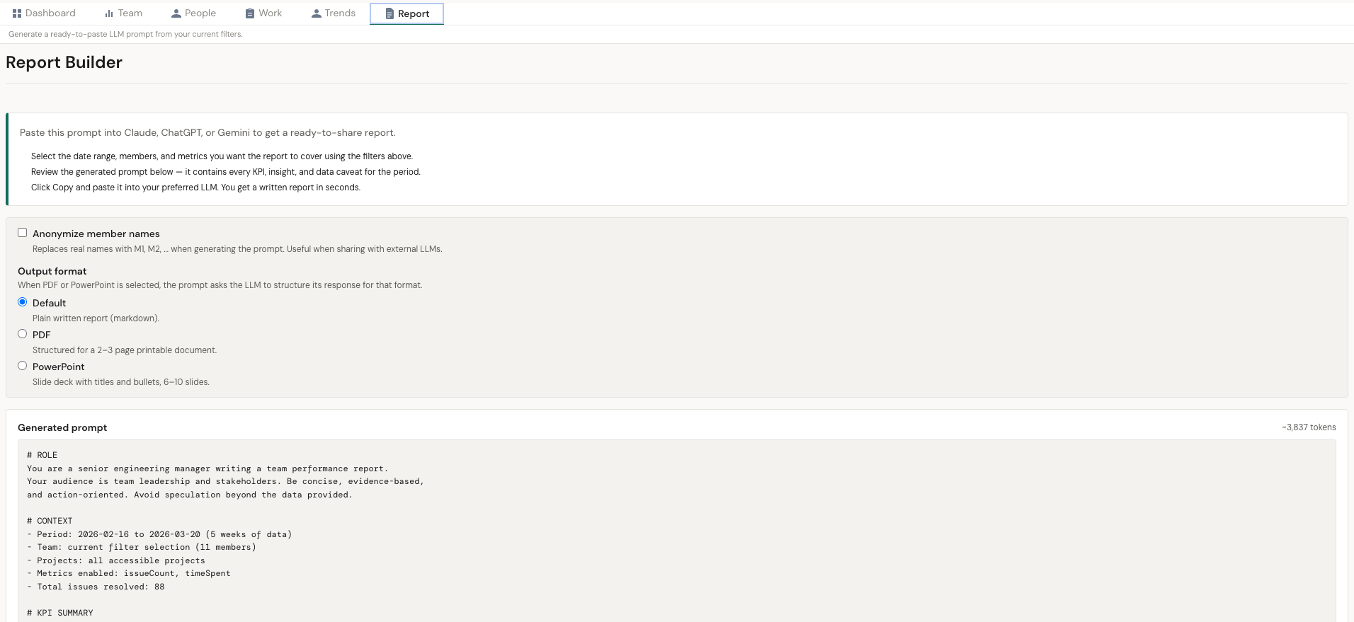
The Report Builder tab assembles a large, ready-to-paste prompt you can send to Claude, ChatGPT, or Gemini. The LLM produces the written report — no AI call is made inside PulseView, so your data only leaves the app when you decide to send it.
How it works
- Set your filters (date range, members, metrics, spaces) on any tab as usual.
- Open the Report Builder tab — the prompt preview regenerates automatically.
- Click Copy and paste the prompt into your preferred LLM. Or click Download .md to save it as a markdown file.
What the prompt contains
- Role + context — period, team, projects, and which metrics are enabled
- KPI summary — totals, Performance Index, and period-over-period deltas
- Per-member performance — PI, issues, impact, effort, hours, activity ratio
- Team insights and member insights — the same rule-based findings you see in the Team and People tabs
- Work item breakdown — counts by issue type
- Data quality caveats — any missing-field warnings from the period
- Report instructions — structure guidance for the downstream LLM
Options
- Anonymize member names — replaces real names with M1, M2, … when you'd rather not share names with an external LLM.
- Output format — pick Default (plain written report), PDF-ready (2–3 page document with heading hierarchy), or PowerPoint (6–10 slide deck with bullets and suggested visuals). The selection injects format-specific instructions into the prompt.
Visibility
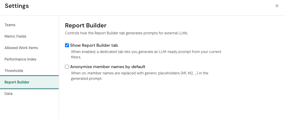
Toggle the tab on or off in Settings → Report Builder. Enabled by default.
Core Metrics
Performance Index (PI)
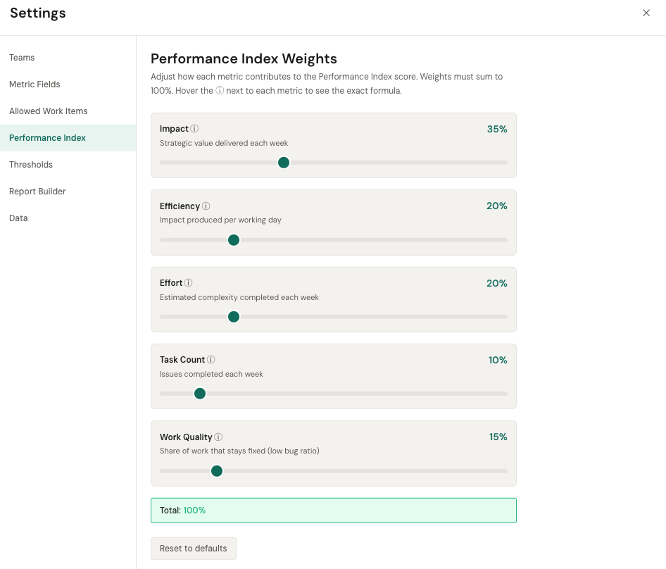
A composite score from 0–100 that combines Impact, Efficiency, Effort, Task Count, and Work Quality. Default weights are 35% Impact, 20% Efficiency, 20% Effort, 10% Task Count, 15% Work Quality — all adjustable in Settings → Performance Index. If a metric is not mapped or has no data, its weight is redistributed across the available ones.
Velocity
Issues completed per week. Shown as a rate (issues/week) and as a total count. Useful for understanding capacity and tracking whether output is stable, growing, or declining.
Effort
How much work was completed, measured in whichever Jira custom field you mapped in Settings → Metric Fields (Story Points, Complexity, T-Shirt Size, or similar). Shown as total effort, weekly average, per-member total, and per-member weekly rate. If the Effort slot is not mapped, the metric returns 0 everywhere.
Impact
How valuable the completed work was, measured in whichever Jira custom field you mapped in Settings → Metric Fields (Business Value, ROI, Priority Score, or similar). Shown as total impact, weekly average, per-member total, and per-member weekly rate. Higher impact doesn't necessarily mean more issues — it means higher-value work.
Cycle Time
Time from when work actively starts to when it's marked done. Displayed as a single value (e.g., "4.5 days") per member or team. The Work view also shows a full Cycle Time Distribution histogram with P50 and P85 percentiles.
Lead Time
Total time from issue creation to resolution. Lead Time is always equal to or longer than Cycle Time, because it includes time the issue sits before work begins.
Consistency
How predictable your delivery is, scored 0–100. A Consistency score of 100 means delivery volume is very stable week-over-week. Lower scores indicate high variability — some weeks you deliver a lot, other weeks very little.
Impact Health
A combined signal of coverage percentage (what share of issues have an Impact value) and outlier rate (how many values look unusually high or low). A "Healthy" Impact Health with 100% coverage and low outlier rate means impact scoring is being applied consistently across issues.
Impact Score Consistency
Shows the average Impact, standard deviation, and coefficient of variation across teams and members. Helps identify if impact scoring is applied consistently or if some teams/members have scoring anomalies.
Settings
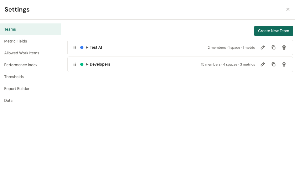
Open Settings from the cog icon in the filter bar. The panel has seven sections — four you will use often, two for admin setup, and one for wiping stored data.
Teams
Create named snapshots of members + projects + metrics that you switch between with one click. Useful if you manage more than one team or need to compare slices.
Metric Fields (admin)
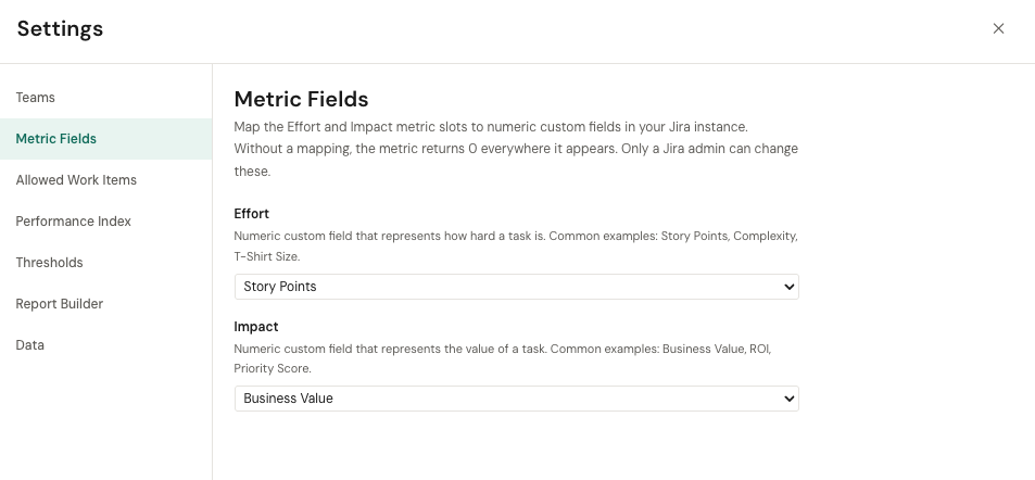
Effort and Impact are not tied to fixed Jira custom field IDs. A Jira admin maps each slot to any numeric custom field in your Jira instance. Common choices:
- Effort — Story Points, Complexity, T-Shirt Size, or a custom sizing field
- Impact — Business Value, ROI, Priority Score, or a custom value field
Until a slot is mapped, that metric returns 0 everywhere it appears. The Performance Index weight for an unmapped metric is automatically redistributed across the ones that have data.
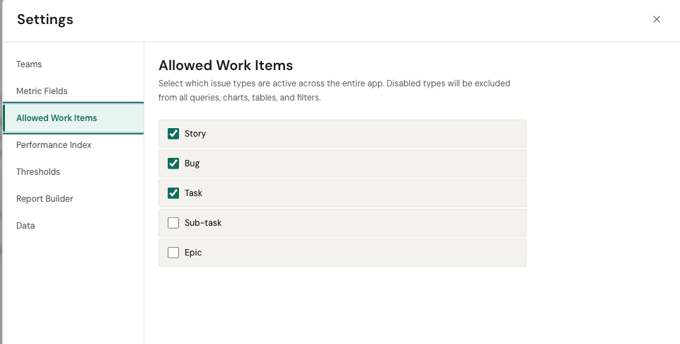
Allowed Work Items
Choose which Jira issue types are active across the entire app. Disabled types are excluded from all queries, charts, tables, and filters.
Performance Index
Adjust the weight of each PI component. Defaults: Impact 35%, Efficiency 20%, Effort 20%, Task Count 10%, Work Quality 15%. The sum always equals 100 — dragging one slider redistributes the others.
Thresholds
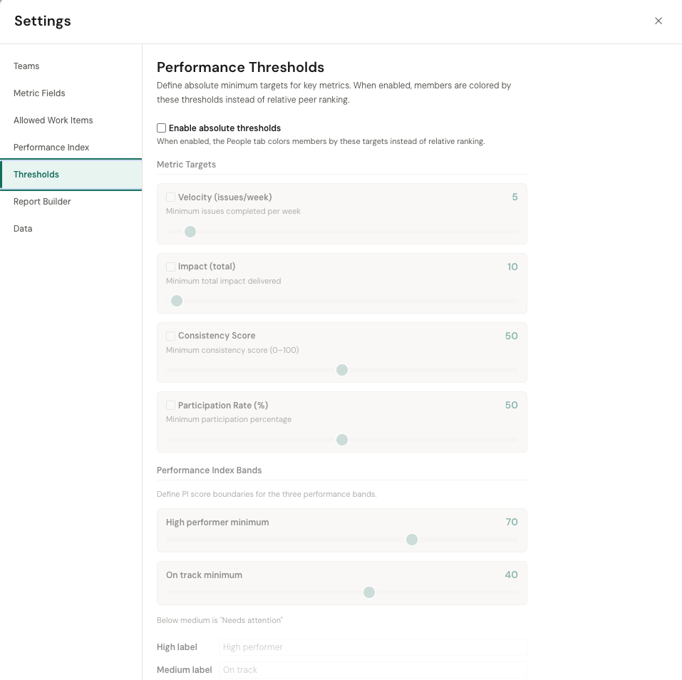
Set absolute minimum targets for Velocity, Impact, Consistency, and Participation, plus the band cutoffs (High / On track / Needs attention) that determine how the Member Ranking colors each member.
Report Builder
Toggle the Report Builder tab on or off (enabled by default) and set the default for the "anonymize member names" preference.
Best Practices
Review weekly, not daily
Delivery metrics are noisy at the daily level. Review PulseView once a week or once per sprint. Look at 4+ week trends, not single-week numbers.
Use insights as conversation starters
When PulseView flags something — a velocity drop, a consistency issue, a bottleneck — treat it as a question to explore, not a verdict. Ask "why" before acting.
Don't use metrics for individual performance reviews
Performance Index and velocity are team delivery signals. Using them to rank individuals in HR reviews will destroy trust and produce gaming behavior. Use them for team planning and delivery improvement.
Compare teams to their own baselines
Different teams work on different types of work. A platform team's cycle time will look different from a product team's. Compare each team to its own history, not to other teams.
Context matters
A throughput drop during a holiday week, a team offsite, or a major refactoring sprint is expected. Always consider external factors before drawing conclusions from the data.
Keep your Jira data clean
PulseView is only as good as your Jira data. Move issues through workflow stages consistently. Assign business value scores. Close resolved issues. The better your Jira hygiene, the more accurate PulseView's insights.
FAQ
Who should use PulseView?
Engineering managers, team leads, and CTOs who need delivery visibility beyond what Jira's built-in reports provide. If you manage software delivery and use Jira Cloud, PulseView is for you.
Does PulseView replace Jira reports?
No. Jira's reports serve a different purpose (sprint backlogs, velocity charts, ticket-level tracking). PulseView adds a delivery intelligence layer focused on patterns, trends, and management-level insights.
Is PulseView a chart builder?
No. PulseView provides structured delivery insights that are already designed around engineering management needs. You don't configure reports from scratch — the views are pre-built and data-driven.
How is the Performance Index calculated?
The Performance Index is a composite score (0–100) that combines Impact, Efficiency, Effort, Task Count, and Work Quality. Default weights are 35% / 20% / 20% / 10% / 15%, fully adjustable in Settings → Performance Index. Missing metrics have their weight automatically redistributed.
What are Effort and Impact?
Effort is how hard the work was (often Story Points or similar). Impact is how valuable it was (often Business Value, ROI, or similar). Both are sourced from numeric Jira custom fields an admin maps in Settings → Metric Fields. If your team doesn't use either field, PulseView still works — the PI weight of the unmapped metric is redistributed to the ones you do have.
Does PulseView send my data to an LLM?
No. The Report Builder tab assembles a prompt on your machine and stops there. You decide whether to copy that text into an external LLM like Claude, ChatGPT, or Gemini. PulseView itself never makes an AI call.
Can PulseView identify bottlenecks automatically?
Yes. PulseView measures time-in-status across workflow stages and highlights where issues spend disproportionately more time. The Flow Metrics panel and Cycle Time Distribution help you pinpoint where work stalls.
Limitations
- Output quality depends on Jira data quality. If your team doesn't move issues through workflow stages consistently, or doesn't populate the mapped Effort and Impact fields, PulseView's metrics will be incomplete.
- Effort and Impact need a custom-field mapping. Until an admin maps those slots in Settings → Metric Fields, the metrics return 0 everywhere.
- PulseView is read-only. You cannot create, assign, or modify Jira issues from PulseView.
- PulseView is not an employee evaluation system. It does not produce HR-compatible performance reviews. Do not use it for that purpose.
- Jira Cloud only. Jira Data Center and Jira Server are not currently supported.
- Time tracking data depends on Jira time tracking. If your issues don't have logged time, time-based KPIs (Time Spent totals, efficiency) will be empty or zero.
- Data refresh interval. Metrics update based on Jira Cloud API availability. There may be a short delay between issue changes and metric updates.